What Does the Symbol “Do Not Enter” Mean in Traffic Signs?
The 'Do Not Enter' sign is internationally recognized for its safety and clarity. It features a bold red circle with a horizontal white bar, ensuring high visibility and immediate recognition.
This design transcends language barriers, making it effective worldwide. Proper placement at eye level and use of reflective materials enhance its effectiveness, especially at night.
Various regions may adapt the sign slightly, incorporating local languages or symbols. Its fundamental purpose is to prevent unauthorized entry, thereby reducing accidents and promoting safety.
For a deeper insight into the history, legal standards, and psychological impact of this key traffic symbol, continue exploring.

Key Takeaways
- The 'Do Not Enter' symbol features a red circle with a horizontal white bar.
- It is designed for high visibility and immediate recognition to prevent unauthorized entry.
- Reflective materials are used to ensure visibility during nighttime.
- Variations exist internationally, incorporating local languages and color schemes.
- Proper placement at eye level and specific distances from intersections enhances effectiveness.
History of the Symbol
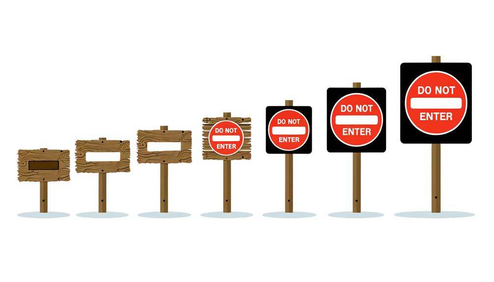
The 'Do Not Enter' symbol, a red circle with a white horizontal bar, has evolved through various iterations since its inception in the early 20th century.
Initially, road signs were rudimentary, often lacking standardization and clarity. The International Convention on Road Traffic in 1909 marked the first steps toward uniformity, introducing basic pictograms to enhance driver comprehension.
Over the decades, traffic authorities globally collaborated to refine these symbols for better visibility and universal understanding. By the mid-20th century, the 'Do Not Enter' sign had adopted its current form, a simple yet effective design easily recognizable by drivers.
Its evolution reflects a concerted effort to improve road safety through clear, standardized signage that transcends language barriers.
Design Elements
Incorporating bold colors and geometric shapes, the 'Do Not Enter' symbol guarantees immediate recognition and comprehension. The primary design feature is a vivid red circle with a horizontal white bar through its center. This stark contrast between red and white guarantees high visibility, even from a distance.
The circle's uniform shape captures attention and signals prohibition universally. Red, a color often associated with warnings and danger, reinforces the symbol's imperative nature. Simplicity is key; the minimalistic approach leaves no room for ambiguity.
The absence of text guarantees that the message transcends language barriers, making it universally understandable. Each element is meticulously chosen to convey a clear, unmistakable message: entry is prohibited.
Legal Requirements

To guarantee the 'Do Not Enter' symbol is effective and enforceable, adherence to regulatory compliance standards is essential. Proper signage placement guidelines must also be followed to ensure visibility and understanding.
These legal requirements form the backbone of effective traffic control and public safety.
Regulatory Compliance Standards
Ensuring adherence with regulatory standards is vital for the effective implementation of the 'Do Not Enter' symbol. Regulatory conformity guarantees not only legal adherence but also public safety and awareness.
There are specific standards that must be met to guarantee the symbol's effectiveness and legality.
- Visibility: The symbol must be clearly noticeable from a distance, guaranteeing that individuals can recognize and respond appropriately.
- Consistency: The design and color scheme must follow standardized guidelines, minimizing confusion and enhancing recognition.
- Placement: Proper placement is essential for compliance, ensuring the symbol is positioned where it can best serve its purpose.
Failing to meet these standards can result in legal penalties and increased risk, making strict adherence crucial.
Signage Placement Guidelines
Proper signage placement is critical to ensure the 'Do Not Enter' symbol is both legally compliant and effectively communicates its message. Signage must be installed at eye level and positioned directly in the line of sight of oncoming traffic to guarantee maximum visibility.
Regulations often mandate specific distances from intersections, typically between 6 to 12 feet, to provide ample reaction time for drivers. Reflective materials are recommended to enhance nighttime visibility. The sign should be free of obstructions, such as tree branches or other signage, to maintain clear visibility.
Compliance with local, state, and federal guidelines ensures that the signage is not only visible but also legally enforceable, thereby enhancing road safety and minimizing legal liabilities.
International Variations
International variations in 'Do Not Enter' symbols are influenced by regional design standards, with notable differences in Europe and Asia. European signs often use a red circle with a horizontal white bar, while Asian traffic symbols may incorporate additional language or characters.
These variations reflect cultural interpretations and local regulatory requirements, highlighting the importance of understanding global signage.
European Design Differences
European countries display notable variations in the design and symbolism of 'Do Not Enter' signs, reflecting diverse cultural and regulatory standards. These differences can evoke a range of emotions and perspectives among travelers. While the core message remains consistent, the visual presentation varies:
- Color Schemes: Some countries use vibrant red backgrounds, while others opt for subtle tones or incorporate additional colors.
- Symbolic Elements: The inclusion of extra symbols, such as arrows or text, can differ significantly, influencing the clarity and immediacy of the message.
- Shape and Size: Variations in the shape (round, rectangular) and size of the signs impact their visibility and interpretation.
Understanding these nuances is essential for fostering seamless international travel and compliance with local traffic regulations.
Asian Traffic Symbols
Exploring Asian traffic symbols reveals a fascinating array of visual designs and cultural influences that distinguish them from their Western counterparts.
For example, Japan's 'Do Not Enter' sign incorporates a red circle with a horizontal white bar, similar to Western signs but often paired with bilingual text for clarity.
In China, the sign features a red circle with a white bar and additional Chinese characters, emphasizing linguistic inclusivity.
Thailand's version also uses the red circle and white bar but includes Thai script, reflecting local language use.
These symbols showcase regional adaptations while maintaining universal elements, ensuring both locals and international drivers can comprehend the message.
This blend of global standards and local tweaks highlights the rich diversity in Asian traffic signage.
Cultural Interpretations Globally
Building on the diverse adaptations of traffic symbols in Asia, variations in 'Do Not Enter' signs across different countries further illustrate how cultural contexts influence design and interpretation.
For example, in Europe, the symbol often features a red circle with a white horizontal bar, whereas in Japan, it may include additional text for clarity. In the Middle East, such signs might incorporate bilingual text to accommodate linguistic diversity.
These differences highlight:
- Cultural Expression: Unique adaptations reflect regional identity and communication styles.
- Safety Prioritization: Variations ensure that local populations comprehend the message clearly and promptly.
- Global Connectivity: Despite differences, the universal nature of such signs fosters international travel and commerce.
Understanding these nuances aids in appreciating global interconnectedness while respecting cultural distinctions.
Placement and Visibility

Proper positioning and high visibility of the 'Do Not Enter' symbol are essential for guaranteeing that it effectively communicates its intended restriction. Placing the sign at eye level and directly within the line of sight of oncoming traffic is critical. It should be placed at the entrance of restricted areas, driveways, or one-way streets facing incoming vehicles. Ideal locations include intersections, parking lot exits, and entry points of private properties.
Moreover, the symbol should be large enough to be seen from a distance, with reflective materials to enhance nighttime visibility. Clear, unobstructed placement, free from visual clutter, ensures the symbol is immediately noticeable, thereby preventing unauthorized entry and maintaining order.
Impact on Traffic Safety
The 'Do Not Enter' symbol plays an important role in enhancing traffic safety by clearly indicating restricted areas, which greatly reduces incidents of wrong-way driving.
This straightforward visual cue helps prevent accidents by ensuring drivers adhere to safe and correct travel paths.
Consequently, its effective implementation contributes to a safer road environment for all users.
Reduces Wrong-Way Driving
Implementing the 'Do Not Enter' symbol effectively mitigates the incidence of wrong-way driving, thereby enhancing overall traffic safety. This universally recognized sign serves as a vital visual cue for drivers, clearly indicating restricted access areas. By preventing vehicles from entering prohibited zones, the symbol plays a pivotal role in maintaining orderly traffic flow and reducing the risk of head-on collisions.
Key benefits include:
- Increased driver awareness: Immediate recognition of restricted areas prevents unintentional entry.
- Enhanced road safety: Reducing wrong-way driving incidents leads to fewer perilous confrontations.
- Streamlined traffic management: Proper signage ensures smoother navigation and compliance with traffic rules.
Incorporating these signs is essential for creating a safer driving environment for all road users.
Prevents Accidents Effectively
Effective deployment of the 'Do Not Enter' symbol greatly reduces the likelihood of accidents, enhancing overall traffic safety. This universally recognized sign acts as a clear visual deterrent, preventing vehicles from entering restricted areas.
By strategically placing these signs at critical junctions, such as freeway off-ramps and one-way streets, traffic flow is regulated, minimizing the risk of head-on collisions and other severe accidents. In addition, these symbols provide immediate, unambiguous guidance to drivers, ensuring compliance even in unfamiliar territories.
The conspicuous design and color contrast of the sign draw instant attention, promoting quick decision-making. As a result, the 'Do Not Enter' symbol is integral in maintaining orderly and safe road environments, contributing notably to the reduction of traffic-related incidents.
Use in Public Spaces
Employing the 'Do Not Enter' symbol in public spaces guarantees clear and immediate communication of restricted access areas. This universal symbol prevents confusion and enhances safety by visually alerting individuals to areas that are off-limits. Its effectiveness hinges on simplicity and recognizability, making it pivotal in diverse settings such as:
Construction Sites: Protects the public from hazardous zones, reducing the risk of accidents.
Emergency Situations: Directs civilians away from danger, ensuring swift and organized evacuations.
Private Property: Maintains privacy and security, deterring unauthorized entry.
These applications evoke a sense of protection and order, emphasizing the importance of clear signage in maintaining public safety.
The 'Do Not Enter' symbol is essential for managing movement and ensuring compliance in various environments.
Digital and Virtual Applications
How has the 'Do Not Enter' symbol been adapted for use in digital and virtual environments, maintaining the same level of clarity and effectiveness as in physical spaces?
Digital interfaces utilize the 'Do Not Enter' symbol prominently on websites, software applications, and virtual environments to restrict access or indicate prohibited actions. The symbol, often a red circle with a white horizontal line, maintains its universal recognition, guaranteeing users immediately understand its intent.
In virtual reality (VR) and augmented reality (AR), the symbol can be three-dimensional, enhancing visibility and interaction. Consistency in design across platforms guarantees users encounter a familiar warning, whether browsing a webpage, using a mobile app, or exploring a virtual space, thereby preserving its effectiveness and clarity.
Psychological Effects

Understanding the psychological effects of the 'Do Not Enter' symbol is essential as its consistent and universal design in both physical and digital environments guarantees immediate user recognition and response. This symbol triggers an instinctual reaction, guiding behavior and promoting safety. The emotional impact is profound:
- Fear and Caution: Instantly evokes a sense of danger, urging individuals to halt.
- Authority and Compliance: Reinforces the necessity to obey rules, reducing non-compliance.
- Relief: Provides clarity and direction, reducing anxiety in uncertain situations.
These psychological responses ensure the symbol's effectiveness, promoting safety and order. Its visual simplicity and universal recognition make it a powerful tool in influencing human behavior across diverse contexts.
Future Developments
Continually evolving, the 'Do Not Enter' symbol is poised to integrate advanced technologies such as augmented reality and smart systems to enhance its effectiveness in both physical and digital domains.
Augmented reality applications can superimpose the symbol onto real-world environments via smartphones or wearable devices, ensuring immediate visibility and comprehension.
Additionally, smart systems equipped with sensors and IoT capabilities can dynamically display the symbol in response to specific conditions, such as restricted access during emergencies.
In the digital domain, embedding the symbol into virtual spaces, websites, and software can provide instantaneous feedback, preventing unauthorized access.
These innovations promise to make the 'Do Not Enter' symbol more adaptive, context-aware, and universally understood, bridging the gap between traditional signage and modern technological advancements.
Conclusion
The 'Do Not Enter' symbol, rich in history and design intricacies, serves as a critical tool for maintaining public safety and order. Legal requirements and international variations guarantee its universal applicability, while strategic placement enhances visibility.
How will its digital and virtual applications evolve in the future? The psychological impact of the symbol underscores its enduring relevance. Continued innovation and adaptation will be crucial in meeting the demands of changing environments and technologies.